Brief
Marcus Stroman asked us to build SHUGO, a luxury baseball footwear and apparel brand, from the ground up. The identity had to carry his story and sit as comfortably in fashion as on the field.
Process
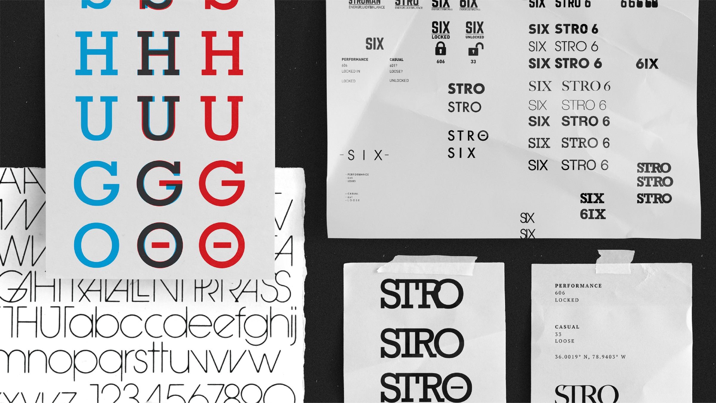
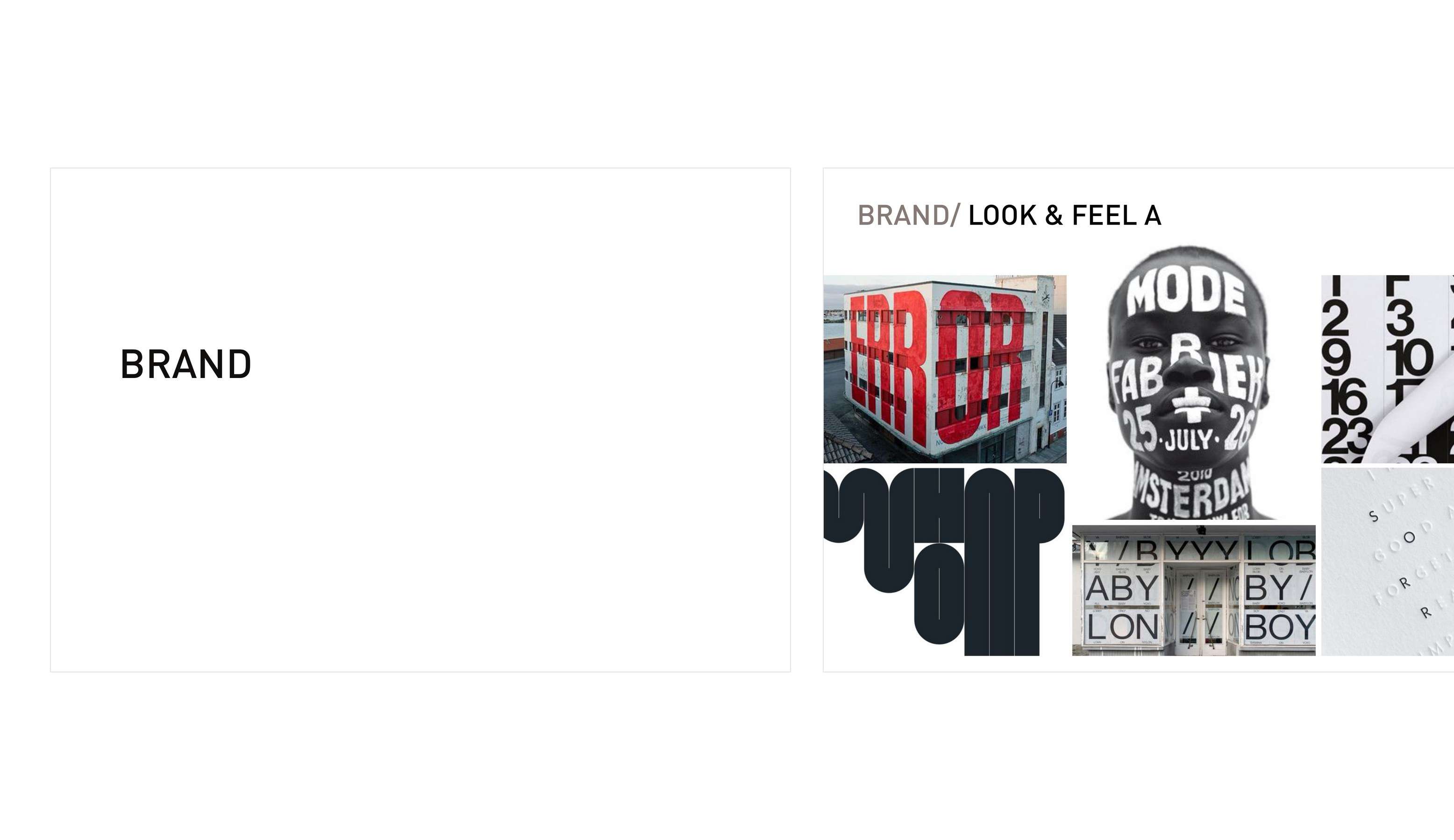
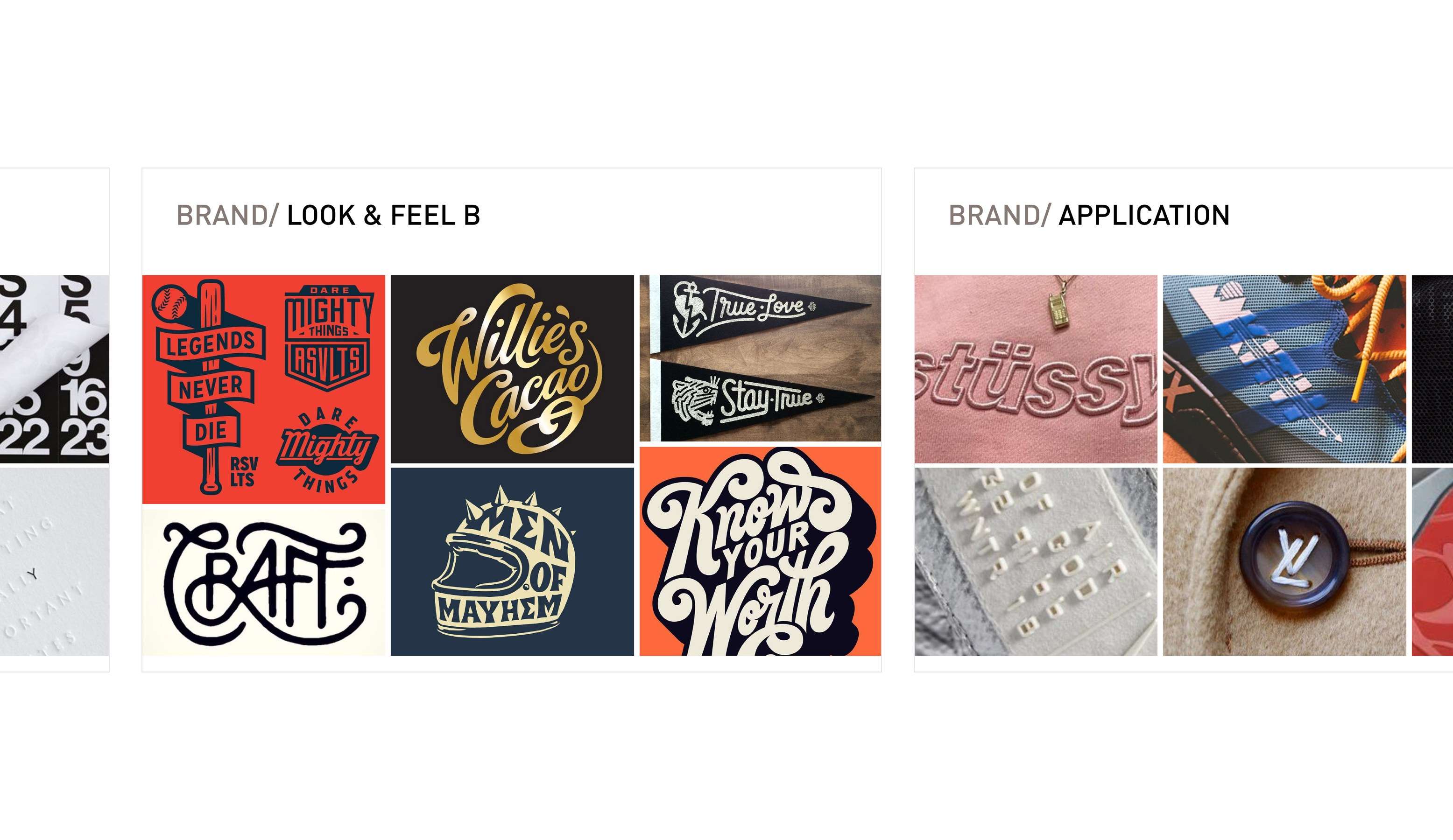
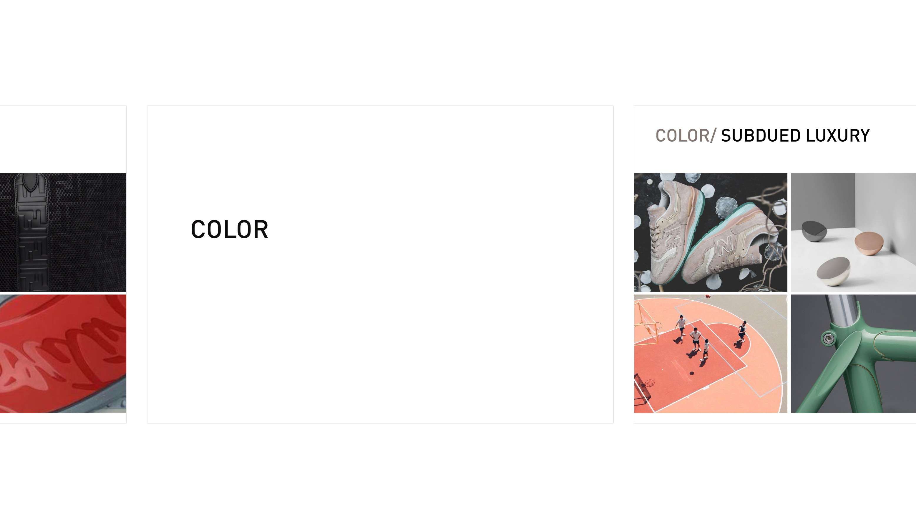
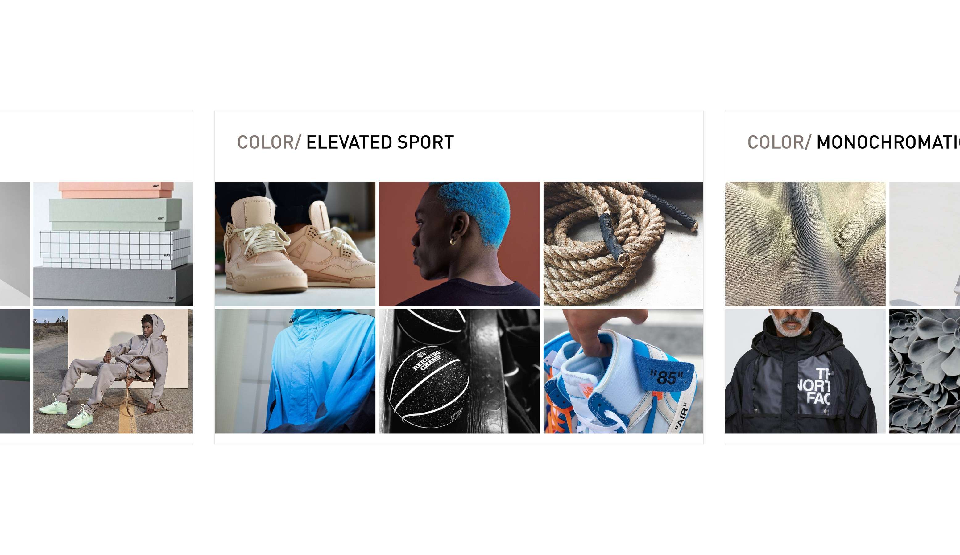
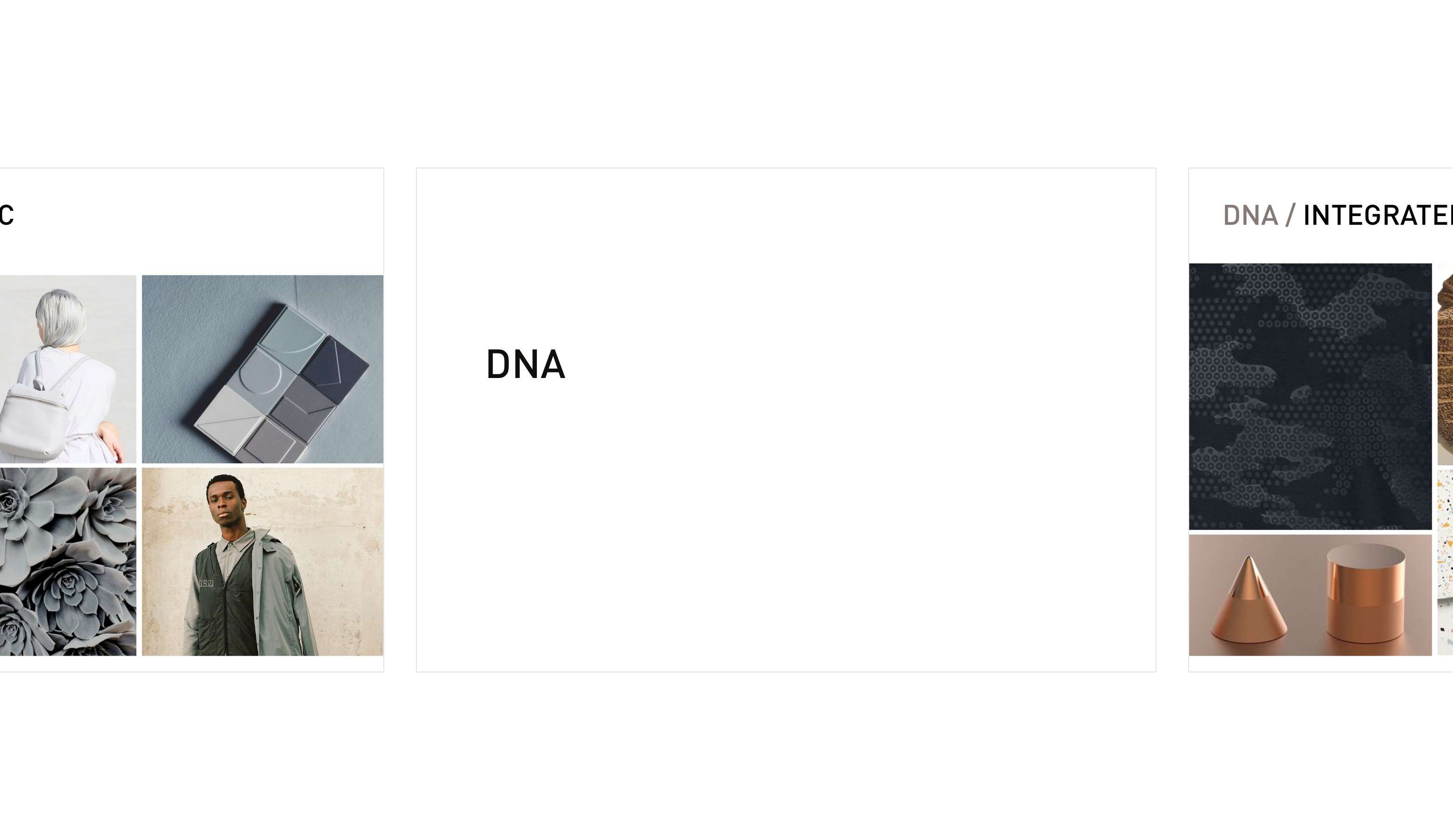
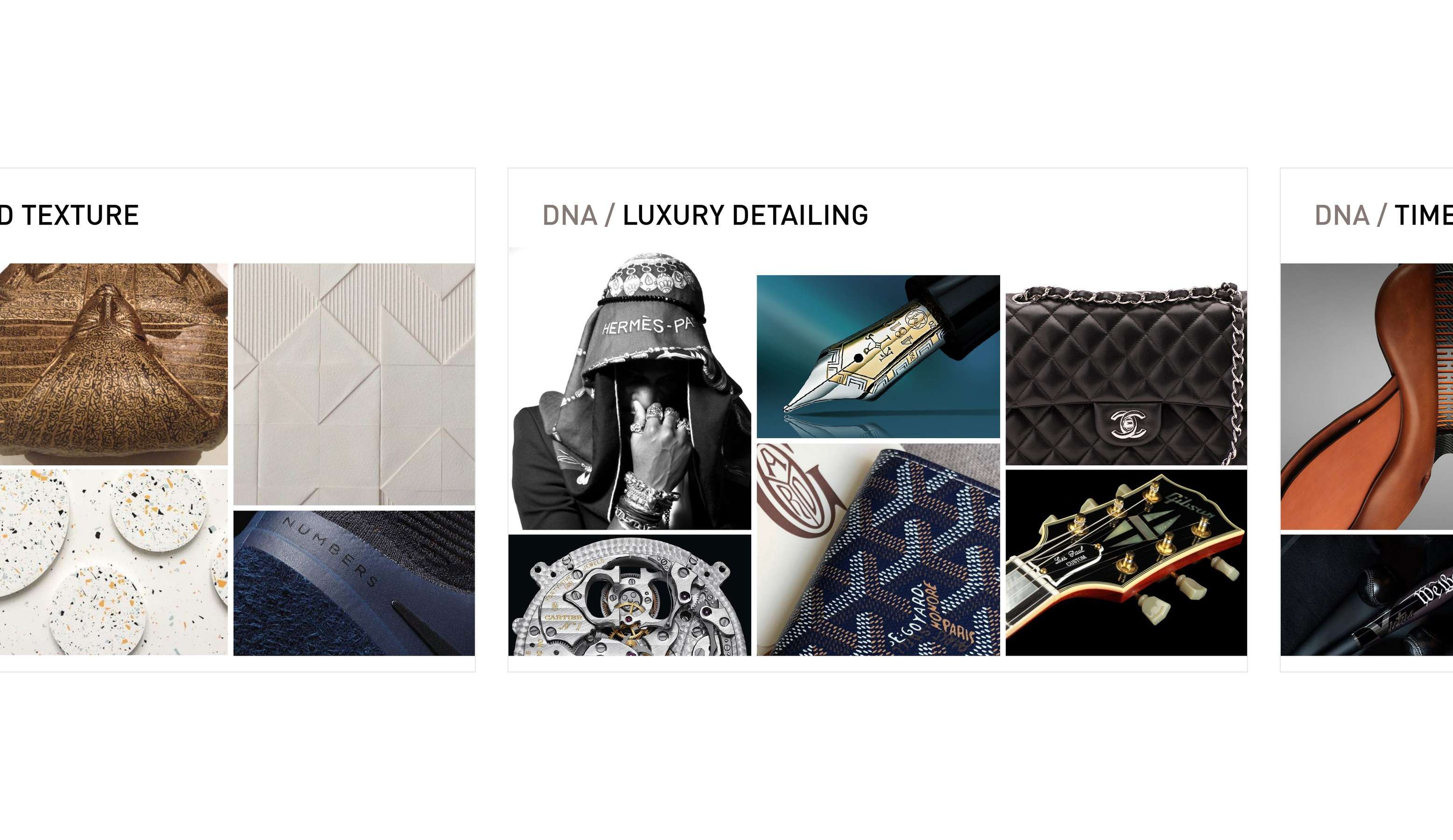
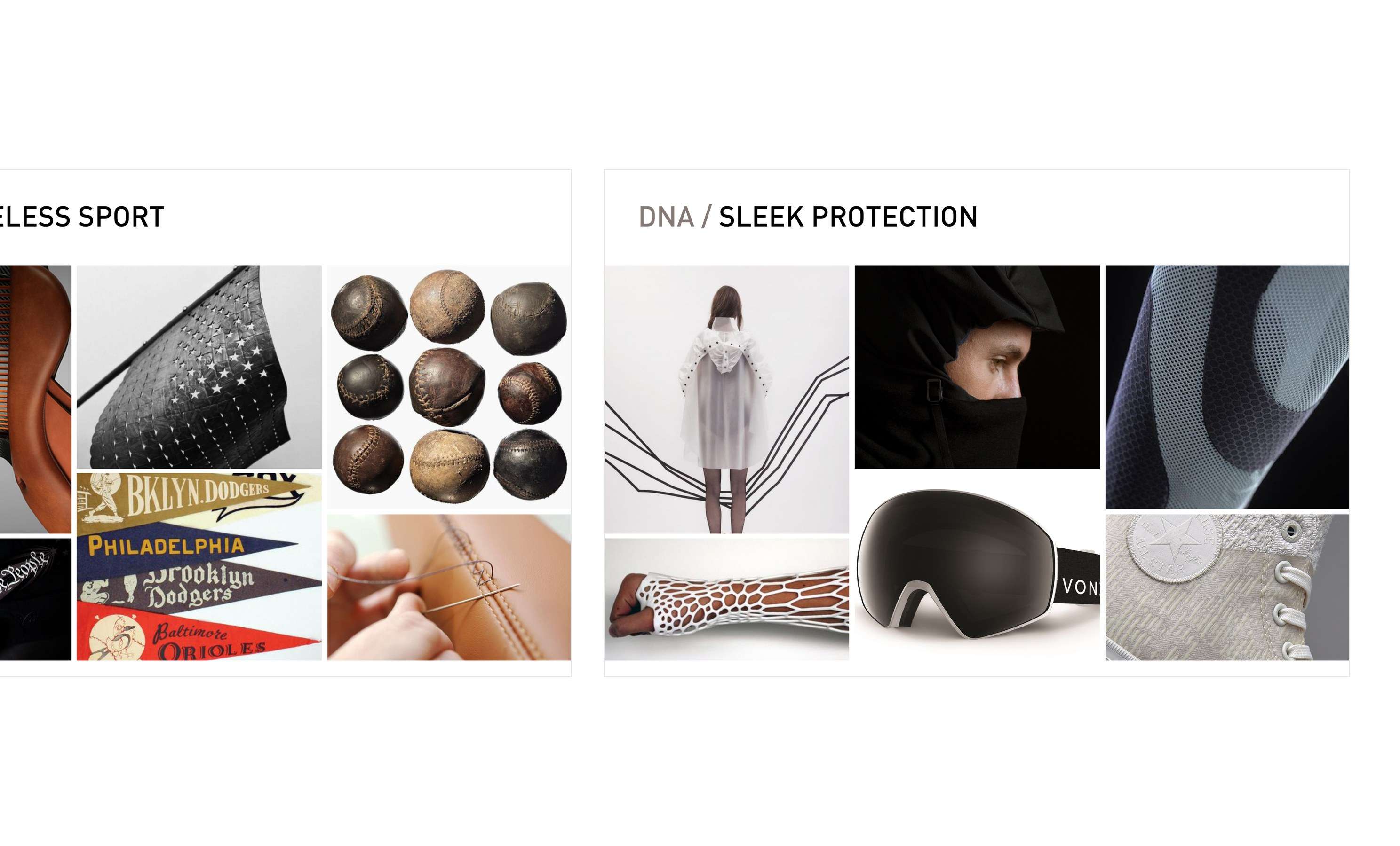
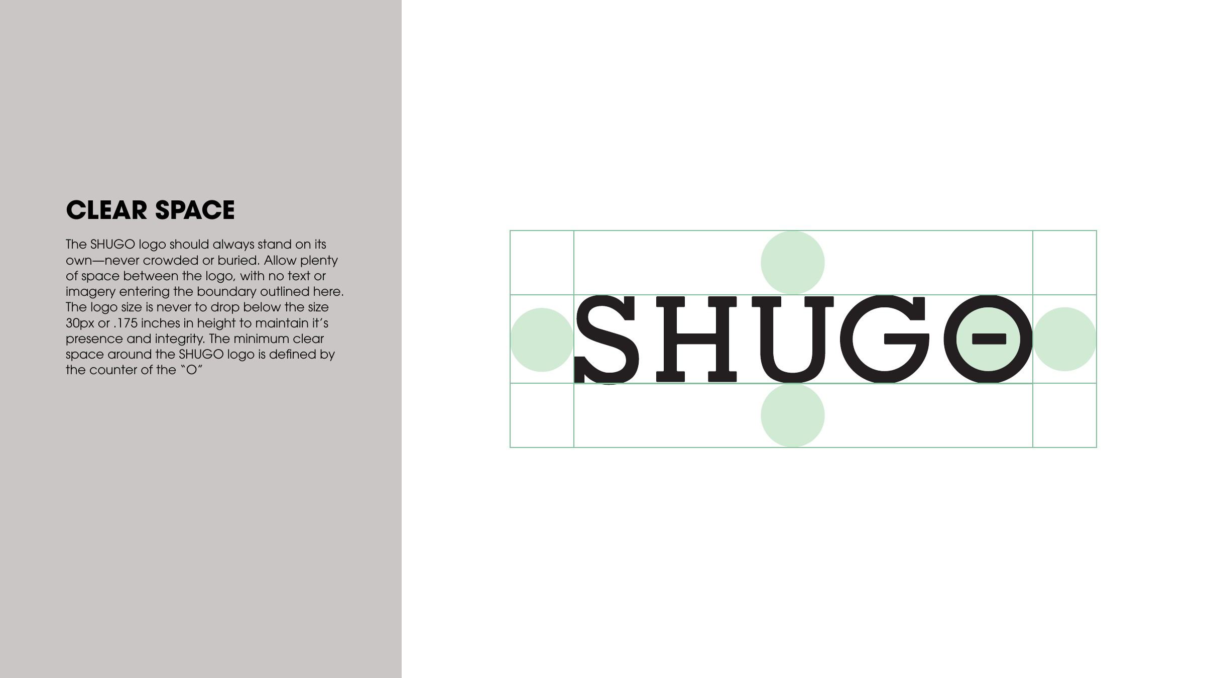
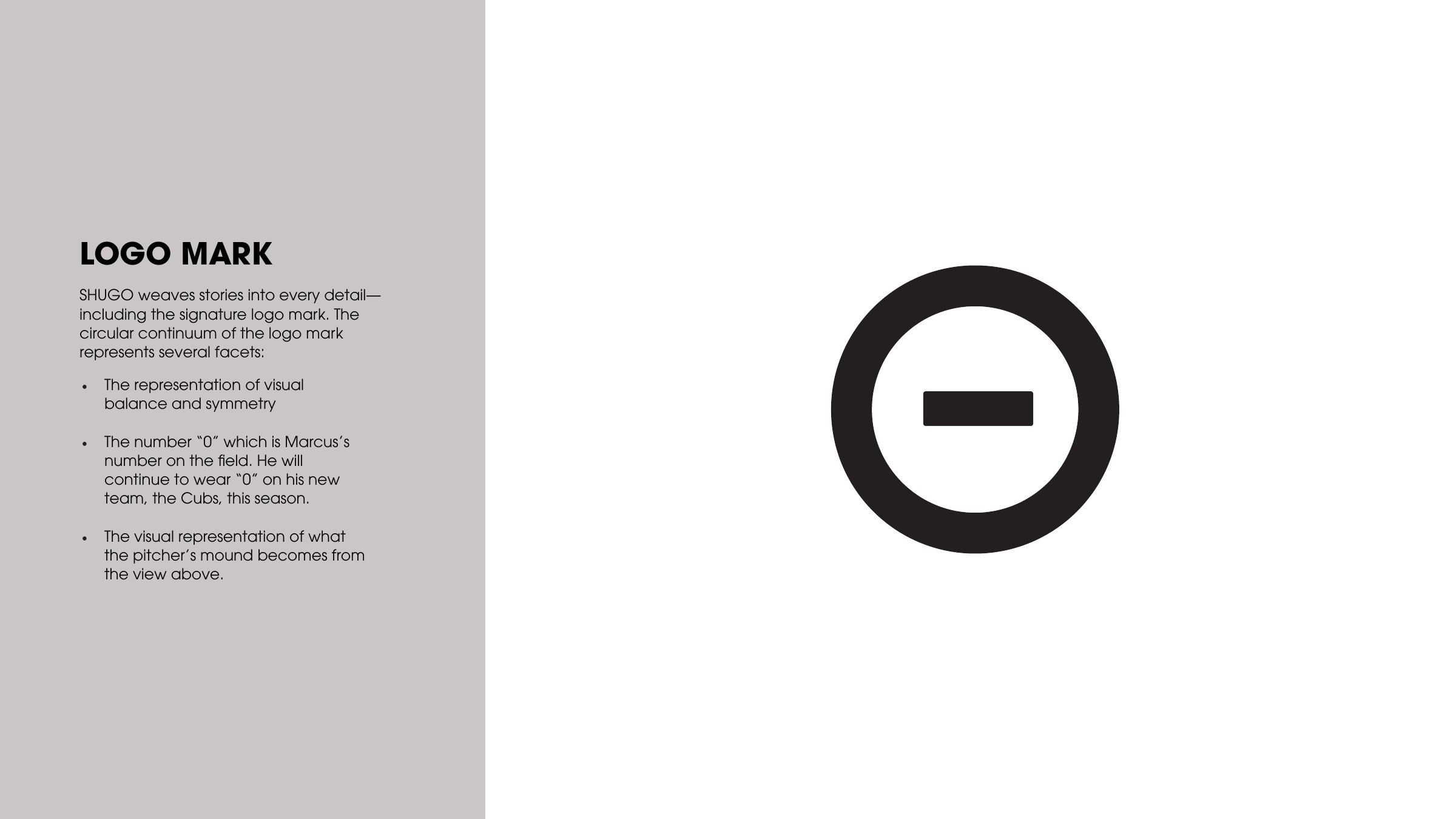
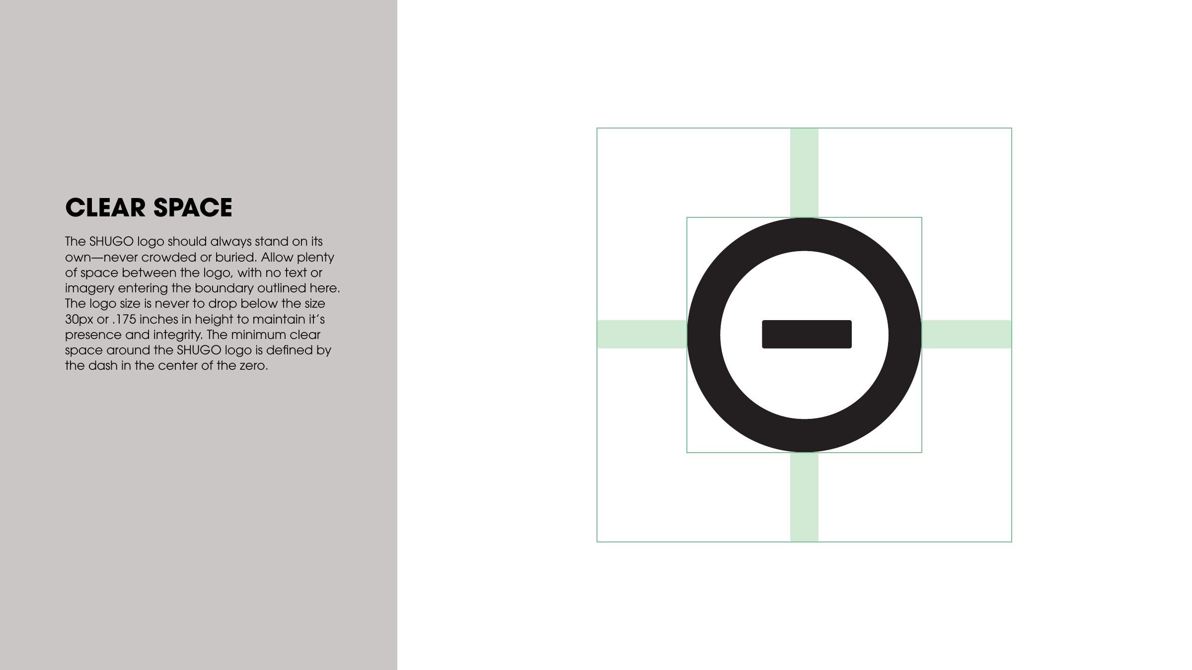
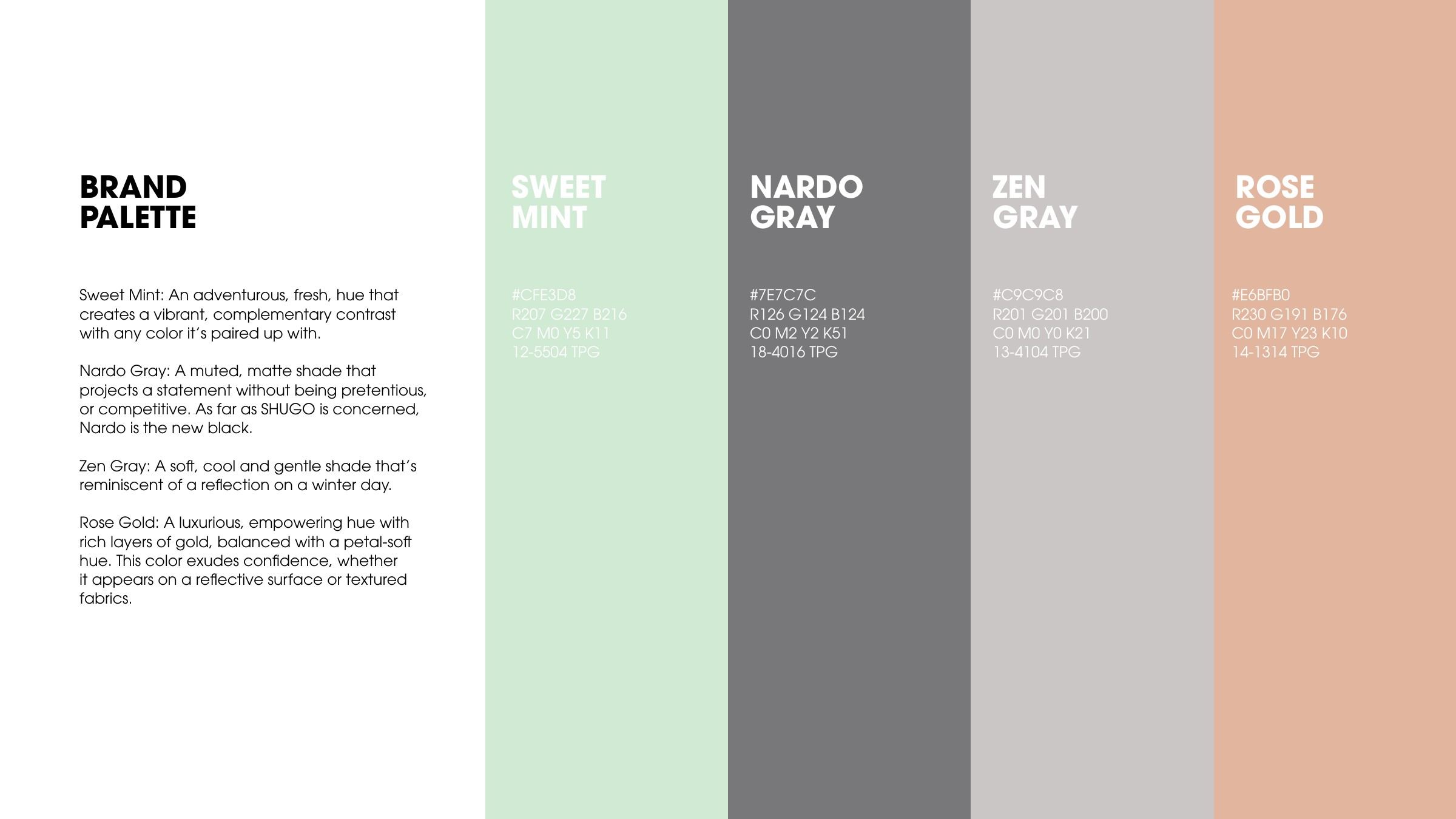
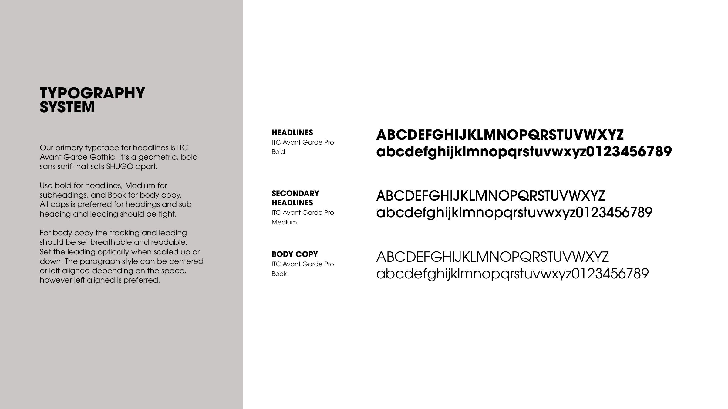
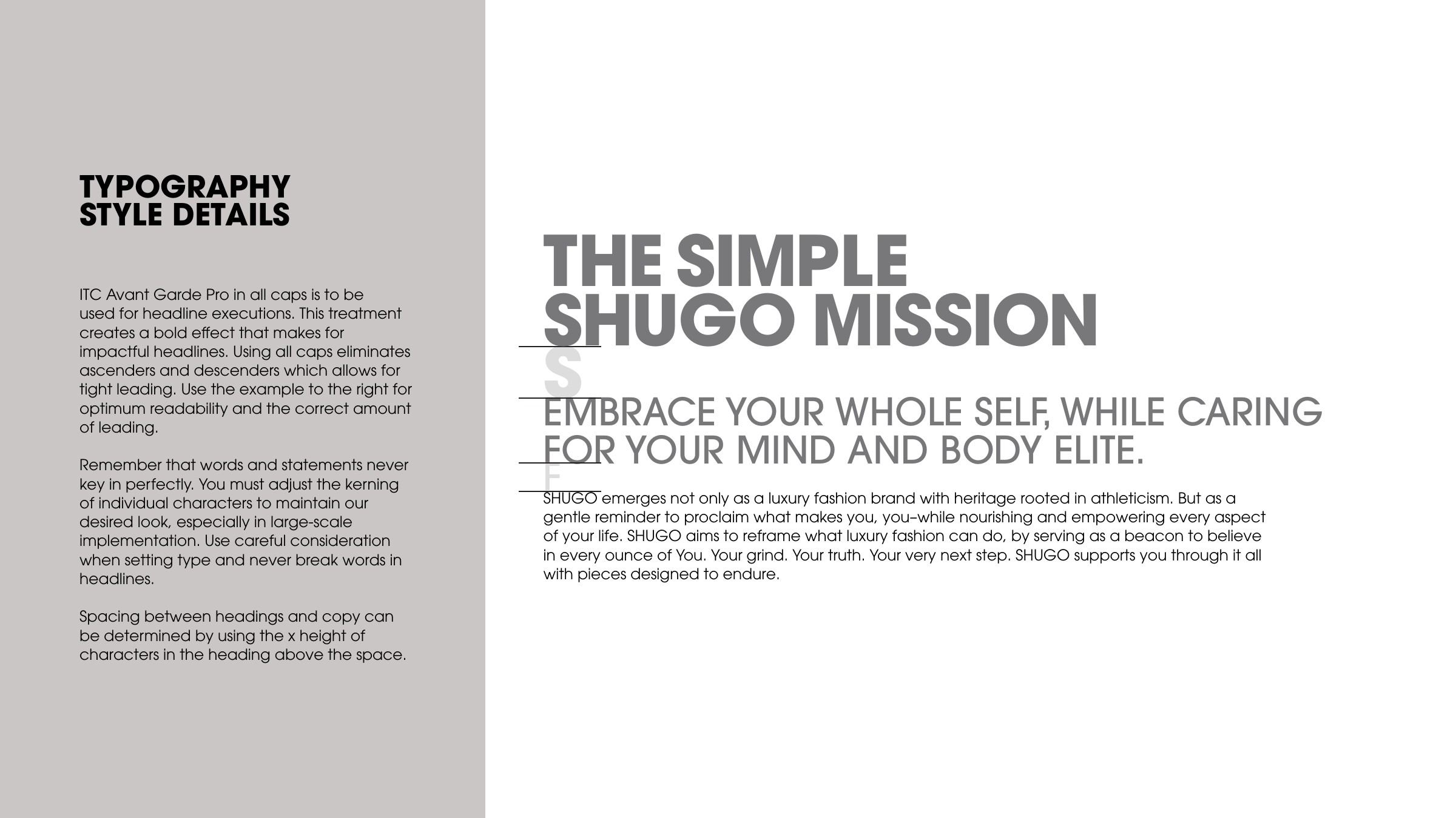
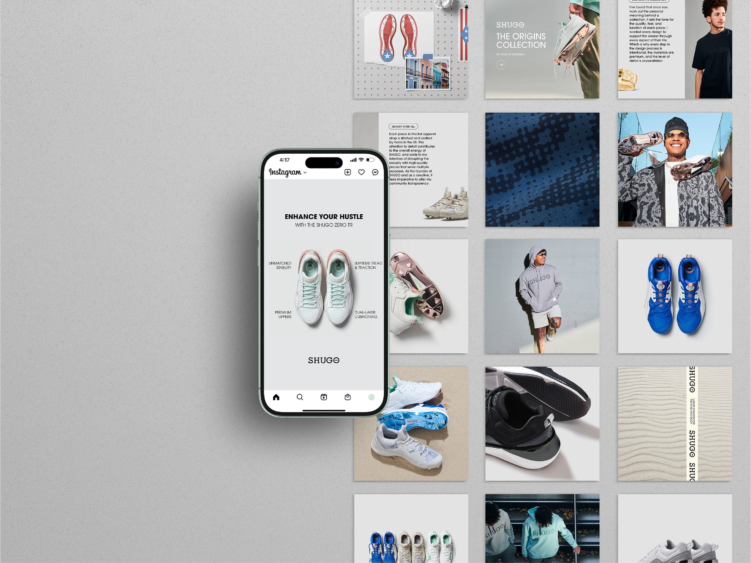
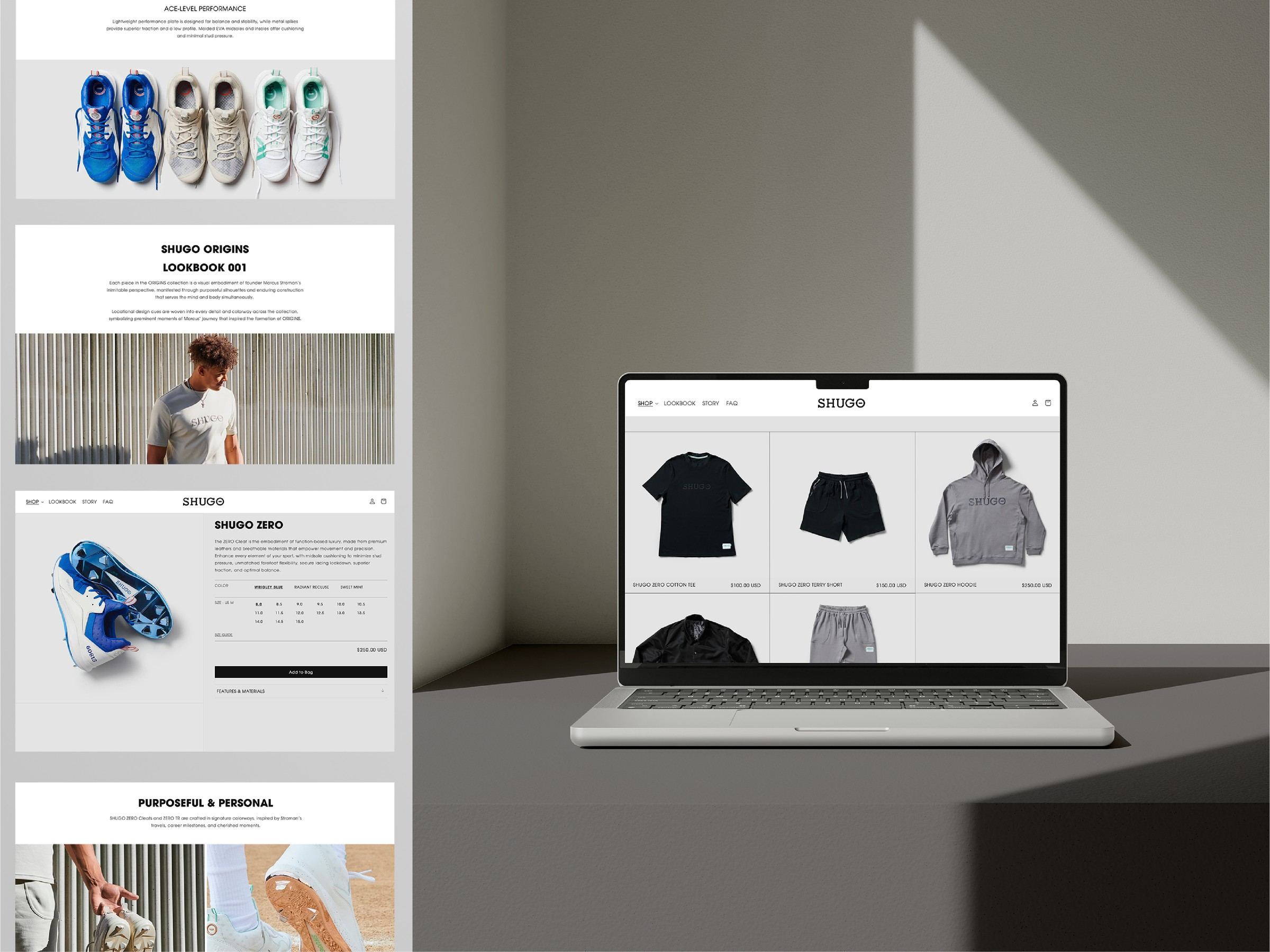
Research came first, with mood boards for the brand’s look and feel, its color, and its DNA, from subdued luxury to timeless sport. Type studies then explored letterforms and lockups for the name, which comes from the Japanese for warrior and protector. The wordmark’s slashed O became the logo mark, a nod to Stroman’s number 0 and to the pitcher’s mound seen from above. Guidelines set clear space, a color palette, and a type system, then carried the identity into social, lookbook, and web.